home inspirations

without jumping the gun, i think it’s safe to say that 2013 has already been a year full of change and personal growth. i’m starting to feel comfortable and settled in this new town: making new friends, struggling through a new job, and always having the pup and the man-friend by my side. for the first time in a while, i feel like i want to settle in and really make the space around me home-like, comfortable, and me. come in and stay a while, why don’t you? 

i shouldn’t be surprised, but i definitely underestimated the challenge that home decorating is. first of all, i spent a long time narrowing down what style home i wanted to have. just like how i have closet ADD, i feel like i could easily have decorating ADD. i knew i liked an eclectic look, but don’t want to feel overwhelmed. i want to feel happy and bright when i’m home, but calm and not cluttered. and because vince has to live here too, i want to make sure that he can be comfortable and represented in our shared space as well.

because we are just at the start of this process, i thought i’d share some photos of other designers’ work and various home goods that inspire me. i’m starting to realize that as a couple, we tend towards clean, modern lines, but with interesting colors and textures to jazz them up. whimsical mid century modern? overtime, i want to build a home that has a personality and a point of view: quirky and fun, but with longevity.

Image

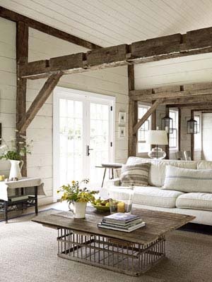
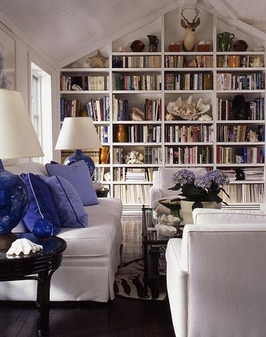
first is probably my favorite room of all time, Bri of Design Love Fest‘s gorgeous living room designed by Emily Henderson. I would die if she ever did my house. It’s so perfect! Livable, interesting, bright, charming, that amazing coffee table… should I keep going? There are more photo’s on both of their sites, and it’s just killer.

Image

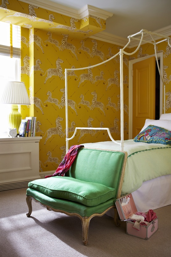
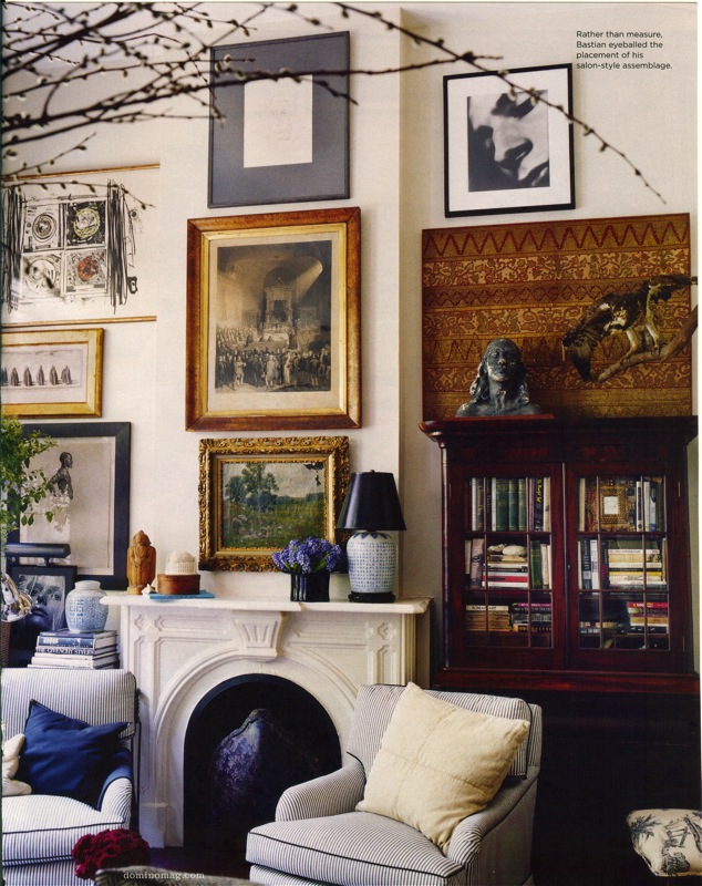
another amazing part of Bri’s house, with help from Emily. i just love it so much. i want it all. the print is amazing, and sets the tone for the color palette, while the dining room set is so clean and beautiful, and those rugs add just the right pop. i just want to eat it all. so good. (photo credit is from Bri’s site).

Image

i think i have a theme with the minty green/blue sofas. this image is from Jonathan Adler‘s spring catalog. while i don’t think my own home would be this glamourous, i do like the feeling that this room evokes. it’s cheerful, and has a sense of humor. JA has the greatest decor accessories…

Image

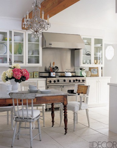
on a different note, i love the crispness of Bradley’s office from Luella & June. totally light and clean feeling. the pops of color are delectable too. i want to make a bold statement with certain pieces of furniture and definitely special works of art, but i’ll want to keep everything else calm and uniform. i like how Bradley did that here.

Image

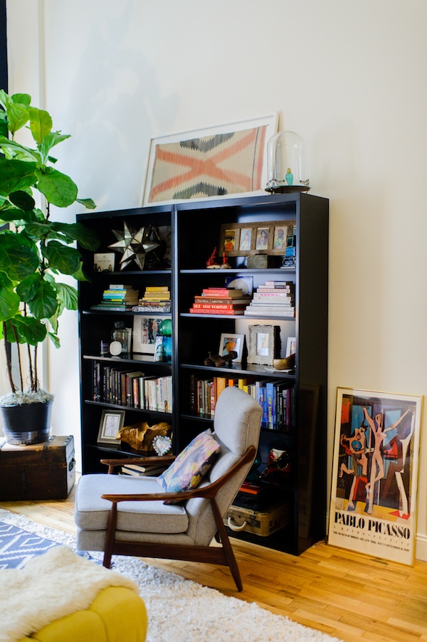
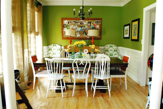
this is Lisa of Lulu Frost’s home, photographed for the Glitter Guide. that chair and i could run off into the sunset. i love the lines and the how masculine it looks. i’m also totally digging the bright picasso print angled on the ground and the complex bookshelf styling. i’m realizing that little details is what makes a home’s style unique and truly yours.

any suggestions as i embark on this journey? i have a feeling it’s going to be a never ending process… and i’ll keep you all posted along the way!

decor dreams: the living room

it’s amazing how quickly time flies by when you’re in the middle of big life changes… i hardly noticed that we progressed from 2012 to 2013 a few weeks ago. i just made a major move from vermont to colorado, and am pretty excited to see what the next few months have in store for me. 

the boyfriend and i have this great little apartment, but at the moment it is BARE. as in, devoid of practically all furniture, artwork, cooking supplies, etc… it’s pretty amazing how little we actually need on a day-to-day basis. decorating and making this place feel like home is a long way off (the job hunt is taking priority right now!), but i can’t help dreaming about what i want to do to our tiny space.  i’m thinking i’m going to have the most fun with our living room: it’s open, has lots of natural light, and a fireplace!

when i started collecting images of pieces that inspired me, i was surprised by the preppy vibe i was exuding… but i think being in a new place is a great excuse to try tastes that are a little out of my wheelhouse. 

any advice for taking on a completely empty apartment? i’m all ears!


{{orange wingback chair/ Kate Spade ‘live colorfully’ pillow/ VOGUE february 1927 cover print/ wall mirror & chaise from Joss & Main/ diptyque candle/ Jonathan Adler happy pillow/ Scalamandre zebra glasses/ gold giraffe & elephant figurines/ Slim Aarons: Once Upon a Time book}}

printed walls

i have to admit, when i think wallpaper, i can only think of this scene in Garden State…

…which is unfortunate, because printed walls are such a cool and fun way to spice up any living space. to try and make my mental wallpaper image a little better, i’ve been keeping my eyes peeled for inspiring printed walls. personally, i would keep the crazy, printed wallpaper to an accent wall or something of the sort, but i do admire the more adventurous designers who can make a whole room both printed and chic. 

with such a bright color and vibrant print such as these walls, it’s important to keep the rest of the decor simple and elegant. 

how awesome is this! at first glance this is such a girly wallpaper… but look closely and you’ll see it’s really images of cowboys and oil wells!

the circus is coming to town! and adding a touch of whimsy to a wall near you!

i’m LOVING this zebra print, especially with yellow. ok… maybe i’m just infatuated with everything about this bedroom…

one of the few examples where i think i would like having a whole room {as long as it’s a tiny bathroom} wallpapered… doggy print! obsessed.

for those of us less inclined to permanently alter our walls, use a wallpaper insert instead! easy to move around if you change your mind. 
how perfect is this bathroom!? sailboats? orange? those tiles!!?

yep, i definitely think i could jump onboard the wallpaper train, as long as it’s full of charming prints or something floral! how do you feel about wallpapered rooms? do you have any favorite prints?


images: 1. 2. 3. 4. 5. 6. 7. 8.
{clearly, i love the design aesthetic of Bailey McCarthy, three of those photos are from her interior designs!}


beaming

by nature, my style trends toward feminine, classic design, with a touch of eclectic and rustic pieces thrown in there. (that sounds kind of confusing…but it’s what i love) a perfect example of this is my love of exposed, rough cut beams for the interiors of homes. i think it stems from my fascination with farmhouses and barns (i do live in new england after all!)

i think the mix of delicate, feminine details juxtaposed with the hearty, masculine beam in the third image is a great example of the style i try to exude, both with fashion and with interior decor. do you enjoy exposed beams as much as i do? 

1. 2. 3. 4. 5.

kitchen quirks: apartment edition

kitchens are my favorite rooms in houses, and notoriously the place where people spend the bulk of their time. unfortunately for the younger crowd, funds to furnish a beautiful  kitchen are a far reach, so, more often than not, apartment kitchens remain completely utilitarian and not at all welcoming. the boyfriend and i have moving on the brain, and of course all i seem to be paying attention to these days are little details that can make a new apartment feel like a home. when renting, obviously major design elements such as layout and the cabinetry are out of your control, but unique kitchenware and artwork can make the place completely yours. 

a kitchen chalkboard is an easy way to coordinate schedule, write lists, and announce that this apartment is your home. create your chalkboard in a separate picture frame using chalkboard paint so that you can easily move it and so that you don’t damage the landlord’s walls. (image via here)


these jonathan adler s&p shakers have been on my wishlist for a while now. i love how he makes something that i would normally want to hide in my cupboard a lovely piece of art to be displayed.

adorable farmer’s market baskets from anthropologie that can be used to display fresh fruit or simply to hold kitchen knick-knacks in a unique way. these would add the perfect pop of color to a countertop or as a practical centerpiece on your table.

monogrammed mugs, also from anthropologie, personalize any apartment kitchen.  how cute  would the ‘g’ and ‘v’ look together?!

candy striped paper straws, available on amazon, are a colorful decoration when displayed in glass jars, or even old milk bottles! (image via here)
these prints of andy warhol’s are whimsical and look great framed individually or when displayed as a set. all of the prints are available from here with framing options available.

i think the best part about these cute home accessories is that they are all priced under $50! so making your apartment kitchen feel like home is feasible after all! 

inspired by: white on white

today, i was going back through pins on my pinterest as a way to gauge styles and trends that have been appealing to me lately. i was not surprised to see many of my pins of white on white, on both my interior decorating and personal style boards. i often wear creamy whites, oatmeals, and beiges as my go-to neutral color: i find it to be much softer with my skin tone than black. below, i posted some of my favorite white on white inspiration on my pinboard. 

*image sources available on my pinterest

crystal clear

being in my early 20’s, i sense a lot of tiny apartments coming up in my near future, so recently, i’ve been keeping an eye out for small space solutions and decorating tips that will make a little apartment feel less cluttered and crowded 


clear acrylic, leucite, and glass furniture are visually light in a small space: they don’t have the heavy, shrinking effect that dark wooden furniture might have. i love the bright, modern look these pieces add to a room, and i particularly like when clear furniture is mixed in with rustic and more classic design elements. 


how do you feel about clear furniture? have you utilized it in a small space you were decorating?


images via 1/2/3/4/5/6

all mixed up

mix and match chairs (and other furniture for that matter) is a look that i’ve always been drawn to: unique pieces that don’t match but compliment each other makes a room seem more lived-in and inviting to me.  however, i find that if not mismatched in a fairly delibrate manner, a room can easily become overwhelmed by mix and match furniture. my favorite look is mismatched chairs that are all the same color or within the same range, it makes for diverse design that’s easy on the eyes. are you into mix and match pieces? how do you keep them from visually cluttering a space?


images via 1. 2. 3. 4. 5.

orange you glad

after a hot and humid weekend, i’m often craving tangy citrus flavors and lively pops of color to shake me out of my lazy state. orange and tangerine hues are the perfect accent to brighten up a room (in fact, ‘tangerine tango’ is Pantone’s color of the year!), or to jazz up an otherwise average ensemble. so whether you are adorning your home or your body, taking a bite out of the orange trend is sure to juice up your look.
bright orange couch and details in the ottoman give focus to an otherwise neutral living space.
(image via here)
the armchair is a tangerine dream and the bookshelf pulls it all together.
(image via pinterest)
orange baubles to brighten a white tee/ frames to add color to your black and white photos/ beautiful floral fabric to make curtains or accent pillows/ side table for lamps and books/ print for your walls/ shocking satchel to boost your mood/ vibrant watch to act as arm candy/ delicate chair to prove bright does not always mean bold/practical sofa that makes a statement/ zebra pillow to pretend that everyday is safari day/summery polish for sassy fingers/a citrus-musk candle that your boyfriend won’t hate/Pantone iPhone case because even your phone should get dressed up

shelf it

in my humble opinion, the most important thing in a home is the collection of book housed within. of course, how you display your books is pretty important too.
the warm honey wood tones against the stark white wall is a biting contrast that really wakes this room up. i’m also loving the vintage chest coffee table.

shelves that take up an entire wall are pure inspiration to me. i love how this one is broken up with books turned horizontally and the gorgeous shells front and center.

the enclosed bookshelf is a way to keep things contained. the art pieces in this room are phenomenal as well. 

i adore this room. the rustic ladder is the perfect accent, not to mention that chair and PILLOW.

over the door and color coordinated– makes the books the complete focal point of the room.

one of my favorite bookshelf displays, not only boasts that amazing bust, but darling art prints and matching peachy/coral tones.
i love this close up of other ornaments you can use to break up the monotony of a bookshelf: figurines and mementos of the places you’ve been.
curved wall… so awesome! also how great is that grey wall color?!

i love the bust on the sixth bookshelf, and the display of knick-knacks besides books also strikes my fancy. what’s your favorite bookshelf design?


(images via: 1. 2. 3. 4. 5. 6. 7. 8.)